Weekend Chart Challenge
Stock markets around the world have gotten choppy again after a period of extended calm and some are asking what’s up and what’s next. The answer, as always, is that we don’t know what’s next in the short run but we do have a high degree of confidence where we’re heading in the long run. It’s just a matter of perspective. As for what’s up, you can take your pick from today’s headlines (more to follow over the weekend, we’re sure): China’s falling currency, China’s slowing economy, the falling price of oil, the rising price of the dollar, the Greek prime minister resigning over the debt crisis, the fear that the Fed will raise interest rates, the fear that the Fed won’t raise interest rates (thus signaling that the economy is weaker than we thought), Japan slipping back into deflation, and on and on. Many if not most of these have been recurring themes, trotted out every time the market gets jittery (we’re reminded of Captain Renault at the end of Casa Blanca saying, “round up the usual suspects“).
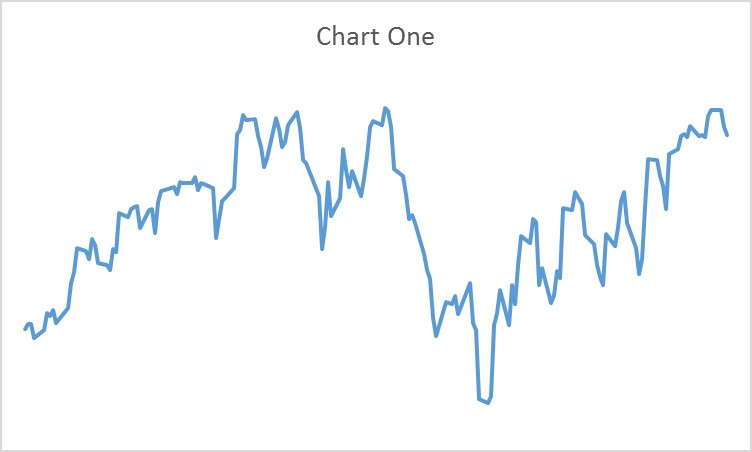
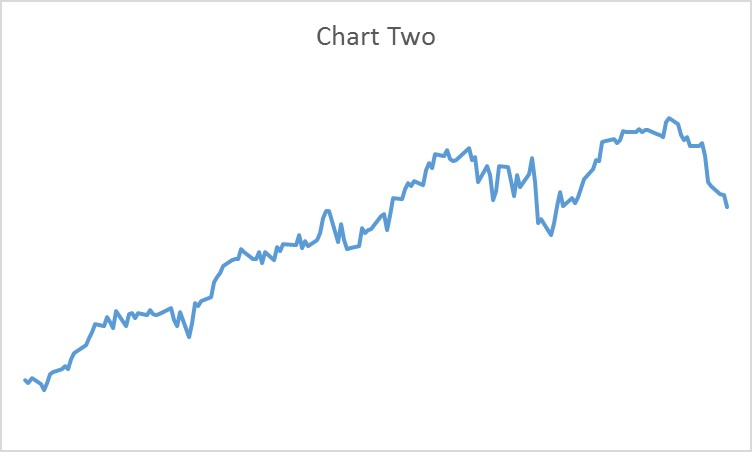
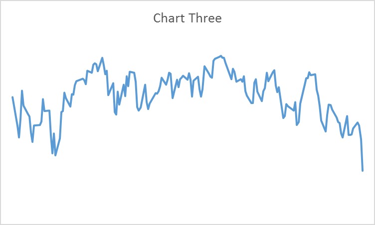
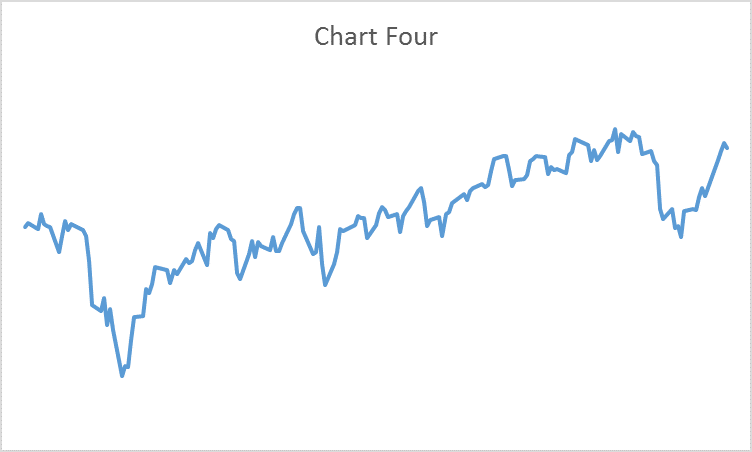
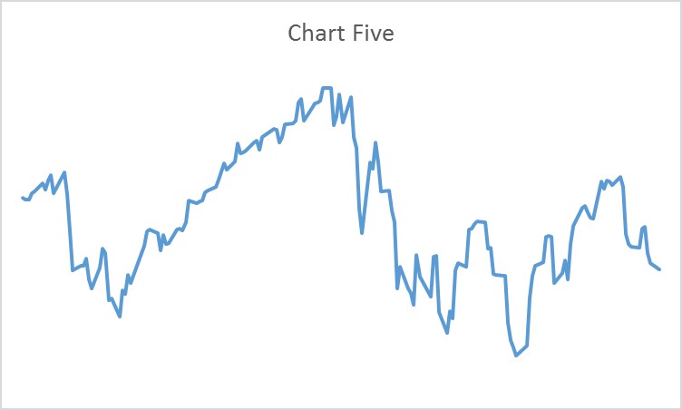
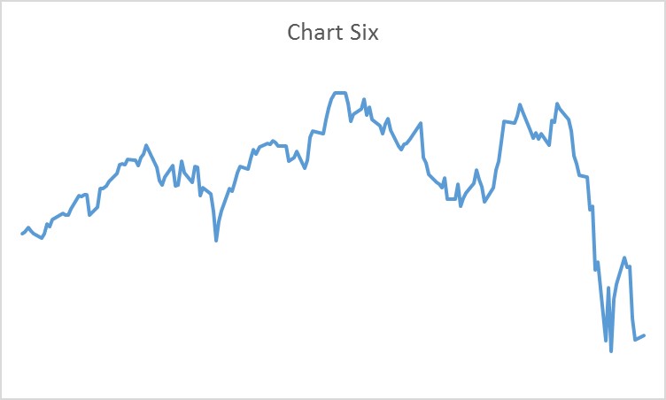
So, in the spirit of that wonderful French saying plus ça change, plus c’est la même chose (the more things change, the more they stay the same) we’d like to offer up a visual pop quiz. The six charts below represent the daily value of the Dow Jones Industrial Average from the beginning of January until about August 21 for each of the past six years. We invite you to match each chart to its respective year.

Answer key
- Chart One: 2012
- Chart Two: 2013
- Chart Three: 2015
- Chart Four: 2014
- Chart Five: 2010
- Chart Six: 2011
Now, for the most important chart, the one that shows the full six year period (click on image to enlarge). We don’t think any additional commentary is necessary.
